Improving Speakly's Start Screen to Increase Engagement and User Satisfaction
YEAR: 2019-2023
About Speakly: Speakly is a language learning app that prepares learners for real conversations, by teaching the most relevant language, in real-life context. It's based on years of scientific research and development, helping one to unlock the world to new opportunities.
CONTRIBUTION: USER RESEARCH, UX/UI DESIGN, ART DIRECTION
Introduction
PROJECT GOAL
Speakly’s engagement and satisfaction KPIs needed work, which resulted in affecting conversion. The goal of the project was to increase those KPIs, in detail:
Engagement (% of users completing daily goal)
User satisfaction (AppStore rating)
Conversion (% of users who purchased a subscription)
FOCUS AREA
Onboarding
Start of the session
Learning vocabulary
LIVE-situations
Listening exercises
Songs
Review Mode
Level Test
Milestones
Results
THE BEGINNING
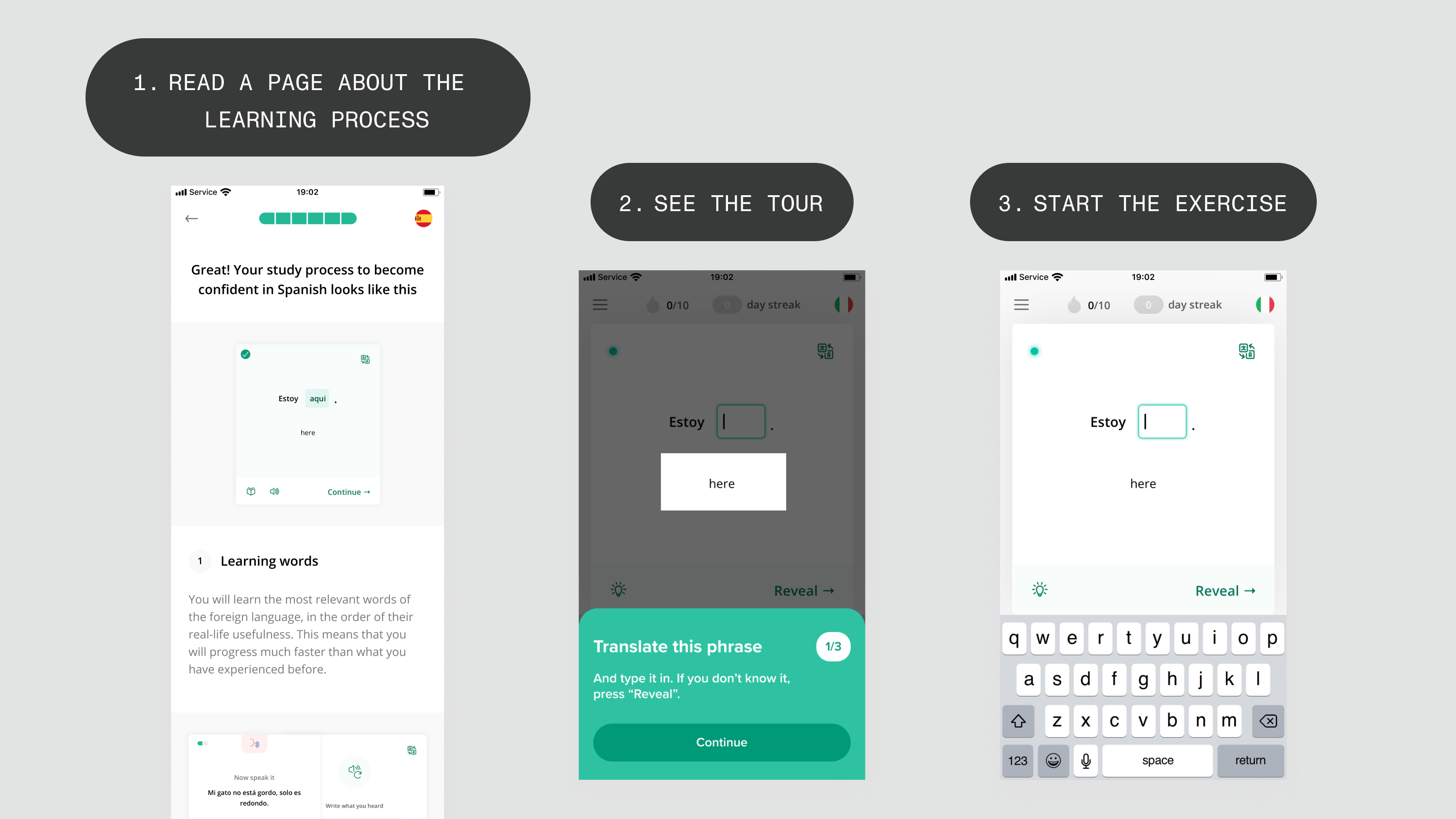
This is how the UX of session start used to look like.
Phase 1 (Discovery & “Start screen”)
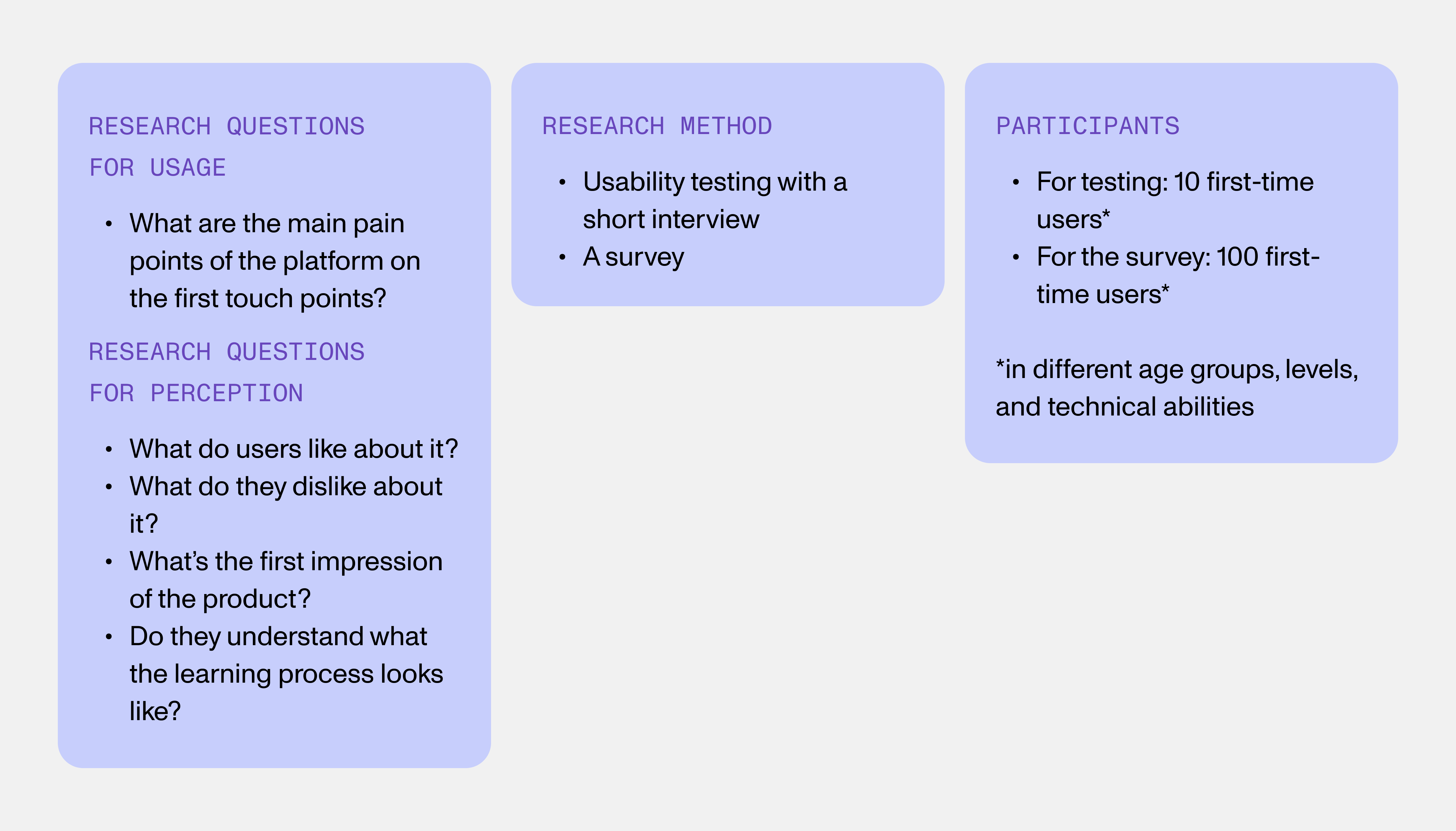
Discovery
The goal was to identify first-time user's pain points through exploratory research.
Research findings
PROBLEMS
Confusion about how to start
60% of users didn’t understand how to start using the app after onboarding.
Unclear goal of exercises
Some users didn’t understand the goal of different exercises, which made them miss out on useful content and perceive the app’s value as lower.
Uncomprehensible study process
Some users didn’t understand the general study process and therefore had lower motivation to study.
UX METRIC
We set a meaningful UX metric: Average time to start the session
Chosen solution
Create a screen called “Classroom” that the user sees at the start of their session.
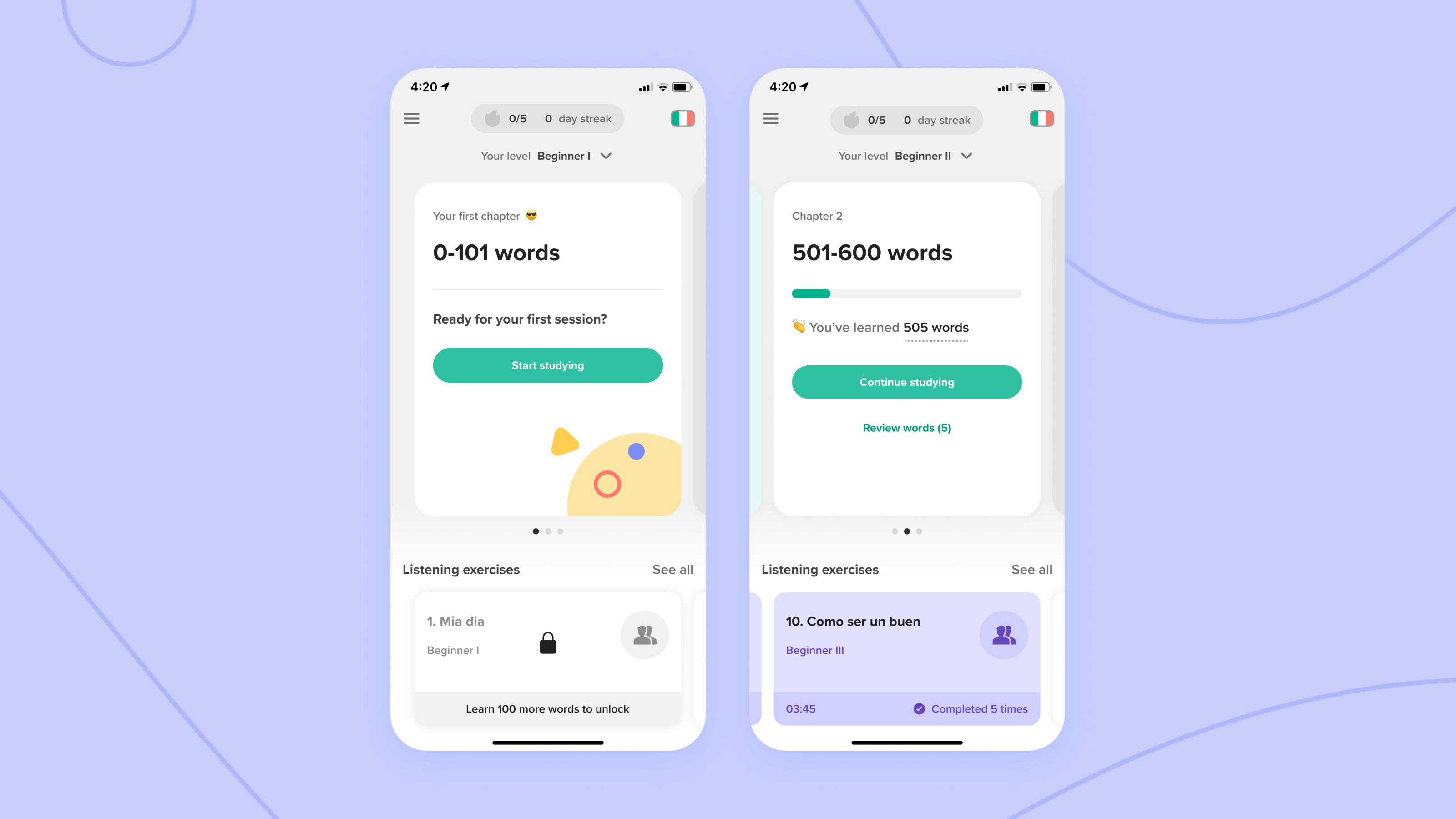
CHARACTERISTICS
Clear process and motivational statistics
The screen gives an overview of the learning process and motivates the user through exciting statistics. Locked items create an anticipation effect.
Perceived value of the app
Since all activities are shown, the perceived value of the app is more likely to be higher.
Hub with one CTA
One clear CTA of how to start studying removes decision fatigue at the beginning of the session.
Moment of taking a breath
The screen creates a moment of pause after onboarding, to not overwhelm the user with performance anxiety that resulted in starting an exercise immediately.
CONFIDENCE
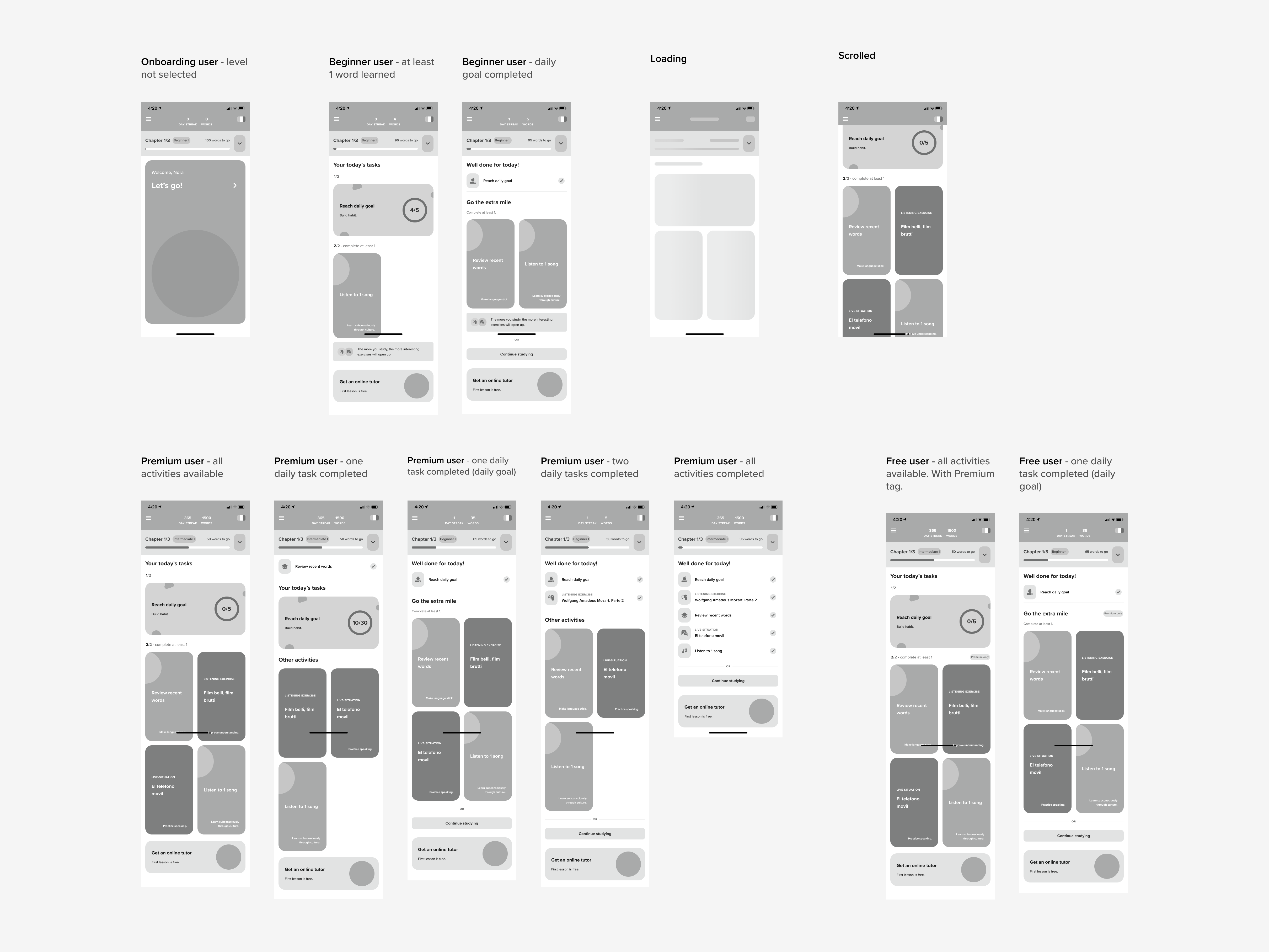
To increase confidence, I conducted usability testing with the wireframes and made two rounds of improvements.
The average time to start the session (UX metric) improved:
139.8 sec (initial) —> 2.5 sec (iteration 1) —> 1.6 sec (iteration 2)
Result
ENGAGEMENT
Small % increase (NDA)
APP STORE RATING
Wasn’t influenced; 3.5 (of 5)
LEARNINGS
The first groundwork was laid and from a usability point of view, the new version performed a lot better than the previous one: the users started their sessions easily. However, to have a more considerable increase in engagement metrics, this was not yet enough (as expected) and we planned to make conceptual improvements in the next iterations.
Phase 2 (”Two daily tasks”)
OPPORTUNITY
To raise engagement, we identified an opportunity that is widely known in the area of productivity. Melissa Gratias, Ph.D., a workplace productivity coach and speaker summarizes it well:
“Breaking tasks down helps us to see large tasks as more approachable and doable, and reduces our propensity to procrastinate or defer tasks, because we simply don’t know where to begin.”
Chosen solution
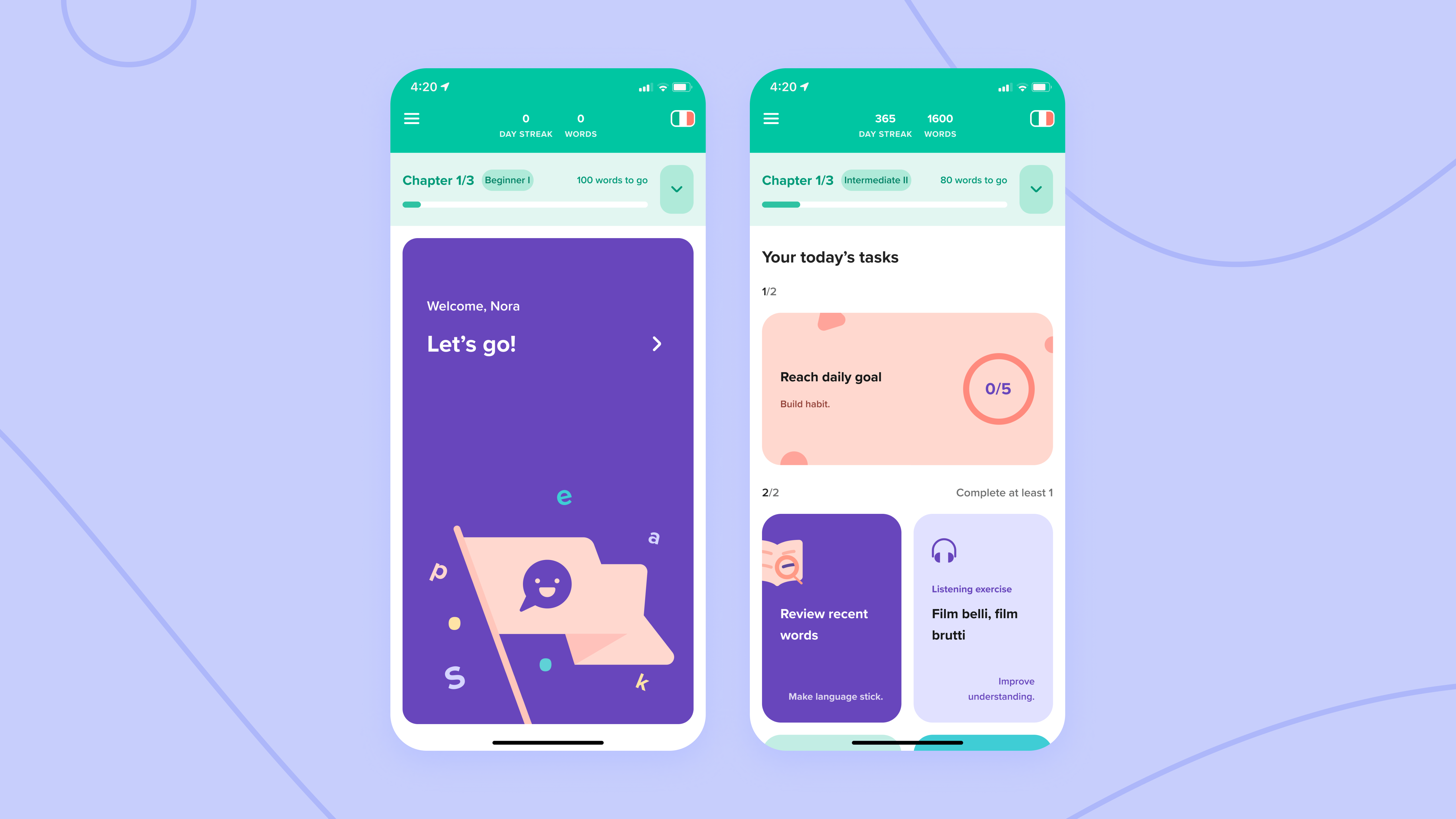
Break the Classroom activities down into 2 daily tasks, with clear value propositions. Therefore:
Tasks feel smaller
The user perceives them as less time-consuming. They are more likely to do one of them and therefore reach the daily goal.
Completing tasks is motivating
The user is more likely to open the app since the concept of the tasks is more motivating to complete.
Clear value
The purpose of exercises is transparent.
CONFIDENCE
Since this was difficult to test, and the Classroom needed a visual uplift, we decided to develop it and continue to iterate on it.
Result
APP STORE RATING
3.5 → 4.3
ENGAGEMENT
Small % increase (NDA)
LEARNINGS
It was clear that the new start screen made a better impression on users and affected the perceived value of the app. With this release, we also improved the UX of the study area which also affected the metrics.
There was an unexpected learning of this version: the new type of structure made some users complete all daily activities, not just the required ones. On one hand, it was ideal that users got engaged enough to go further than the daily goal. On the other, we had a concern that some users could feel that they had to complete all the exercises displayed. This would have meant that studying with Speakly could feel more time-consuming than it is and therefore its usage would be postponed during the day. I decided to observe this behavior a bit longer.
One thing was sure: we were confident that a guided and motivating daily structure to the studies was an important factor to improve on.
Phase 3 (”Points” system)
OPPORTUNITY
To improve the engagement through the daily learning structure, we identified an opportunity from game design [source]:
"Scores and points motivate users and ensure they’re more willing to continue using products, and services, keep learning, or do something else that is specific to your niche. That is the only way for users to achieve a higher level. Then, the cycle continues. The users are motivated to keep winning points until they reach a new level, and so on.
Gamification points lead to either virtual or concrete benefits, sometimes both. The main point is that users know their points lead to something specific. That way, you create a meaningful experience for everyone involved."
Chosen solution
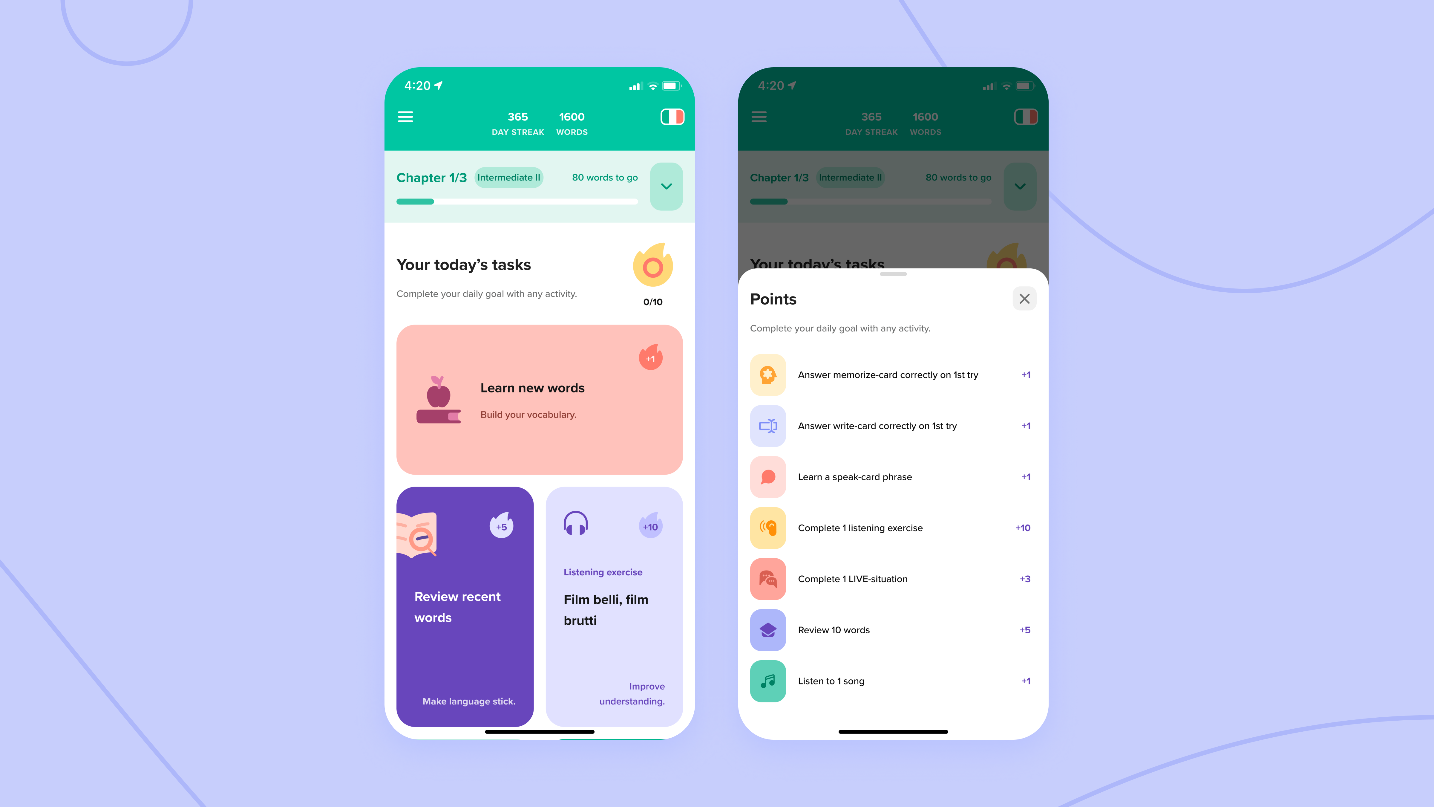
Allow collecting points, and enable reaching the daily goal with all activities. This would make the experience more captivating and varied, and therefore:
Reaching the daily goal is fun
The user is more likely to open the app and reach the daily goal since the concept of collecting points is more motivating to complete.
Play will aid better results
Joining play and studying will help the learnings stick better.
CONFIDENCE
Other language-learning apps had already successfully validated this approach, and by this time we had reached the technical availability to develop it.
Result
ENGAGEMENT
Substantial % increase (NDA)
APP STORE RATING
4.3 → 4.7
LEARNINGS
I'm glad we decided to prioritize this concept, as it turned out to be successful. Also, the previous concern and assumption that users felt required to do all exercises and that it affected engagement didn't hold true, because we kept a similar structure in the new version. The previous daily structure just wasn't as motivational to complete as the new one.
Phase 4 (New visual identity)
Problem
Outdated design has an impact on the first impression
The design had become dated. Since the start screen has a big impact on the first impression, there was an opportunity for improvement. Aesthetics induce emotion, memorability, and engagement.
Users didn't find some learning content
Based on user recordings on Smartlook, users were not using the hamburger menu and therefore still not accessing some parts of the platform.
Solution
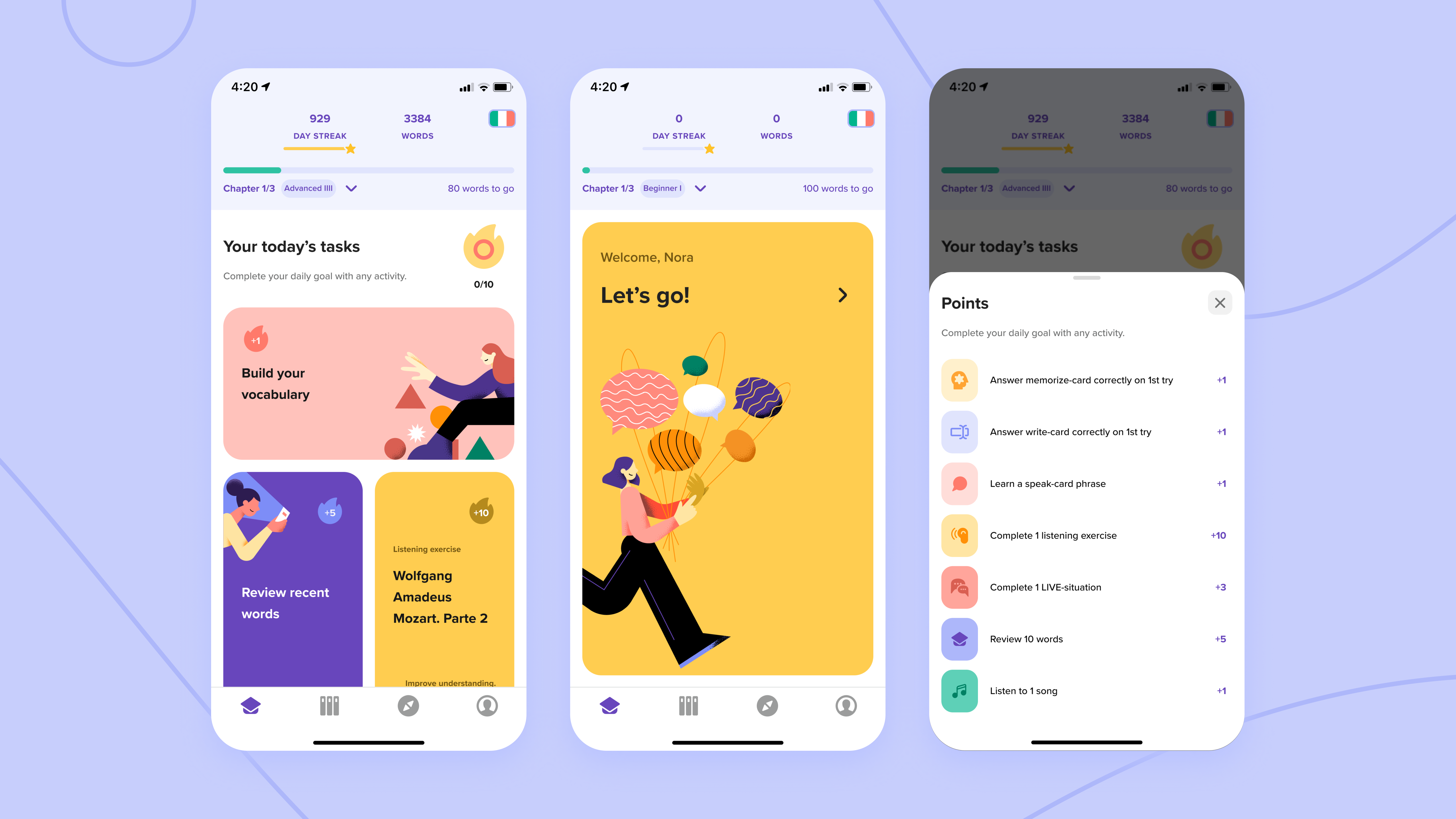
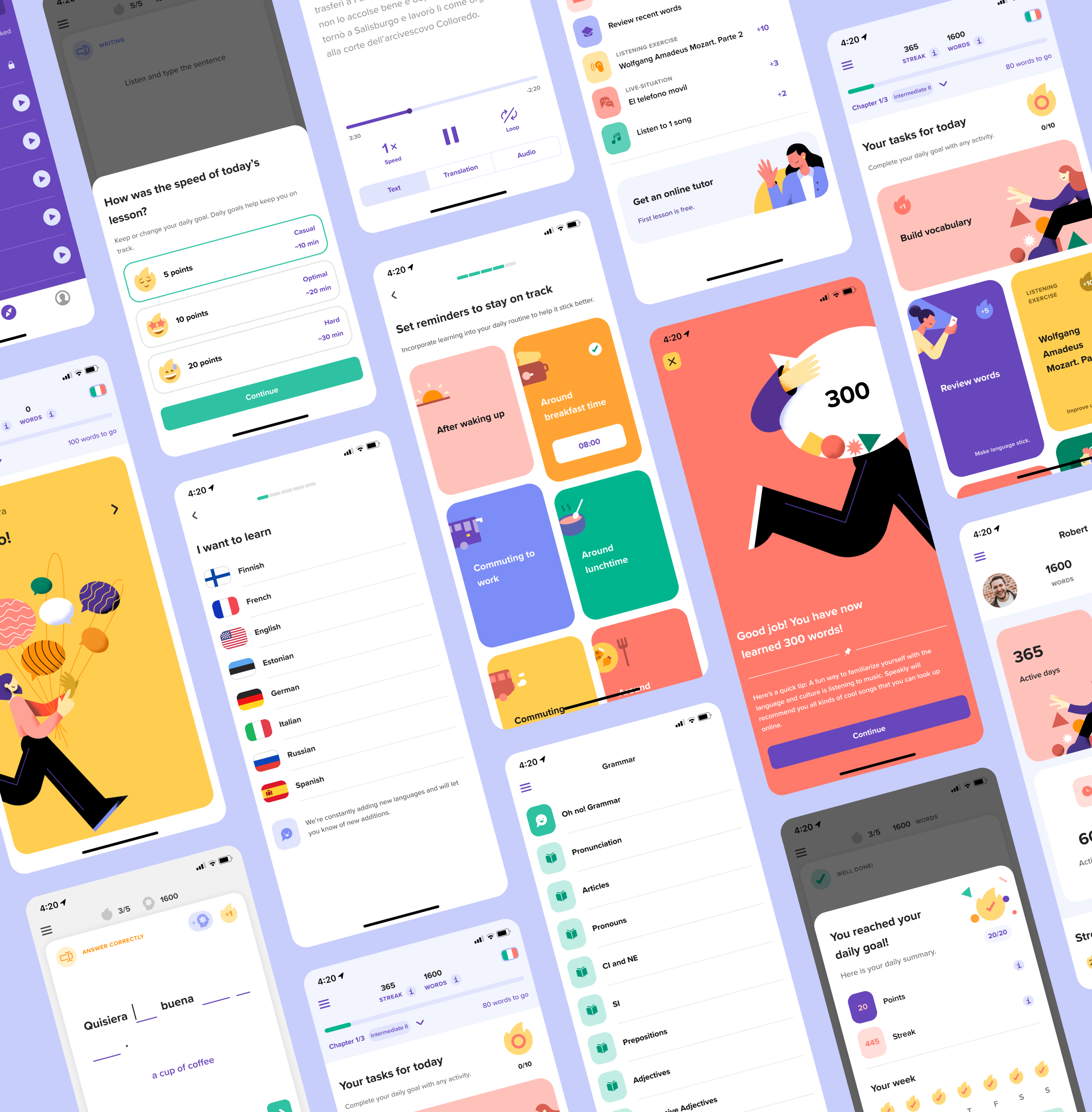
First, I created Speakly visual identity 2.0 along with illustrations. The following is a small overview of the result of the project.
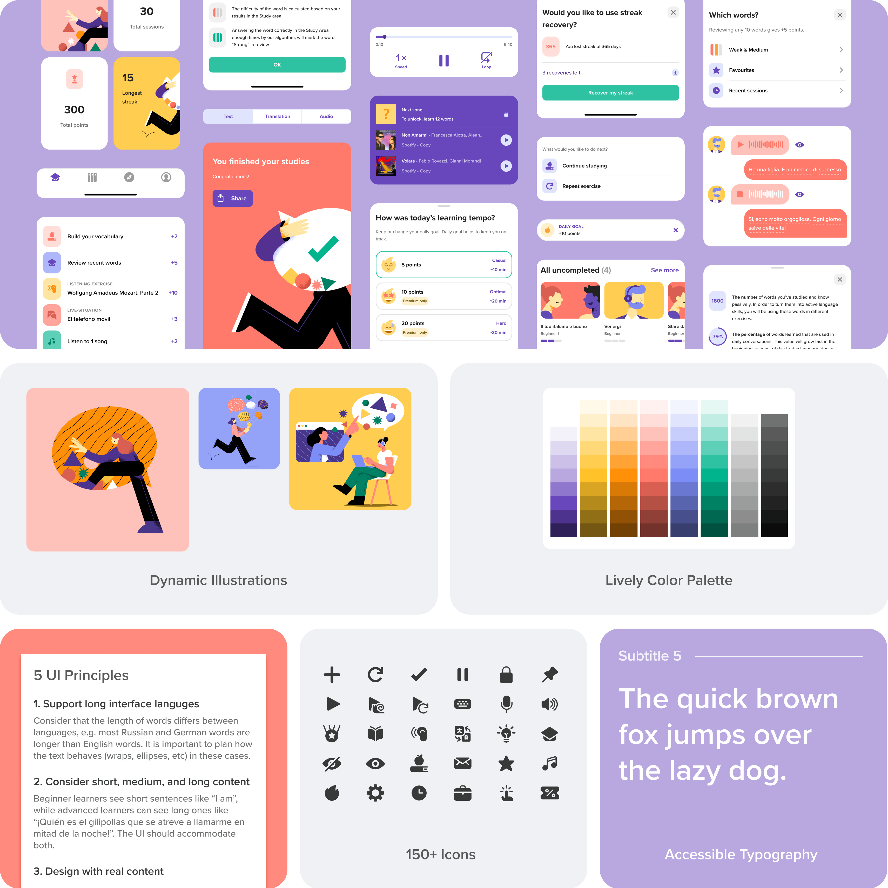
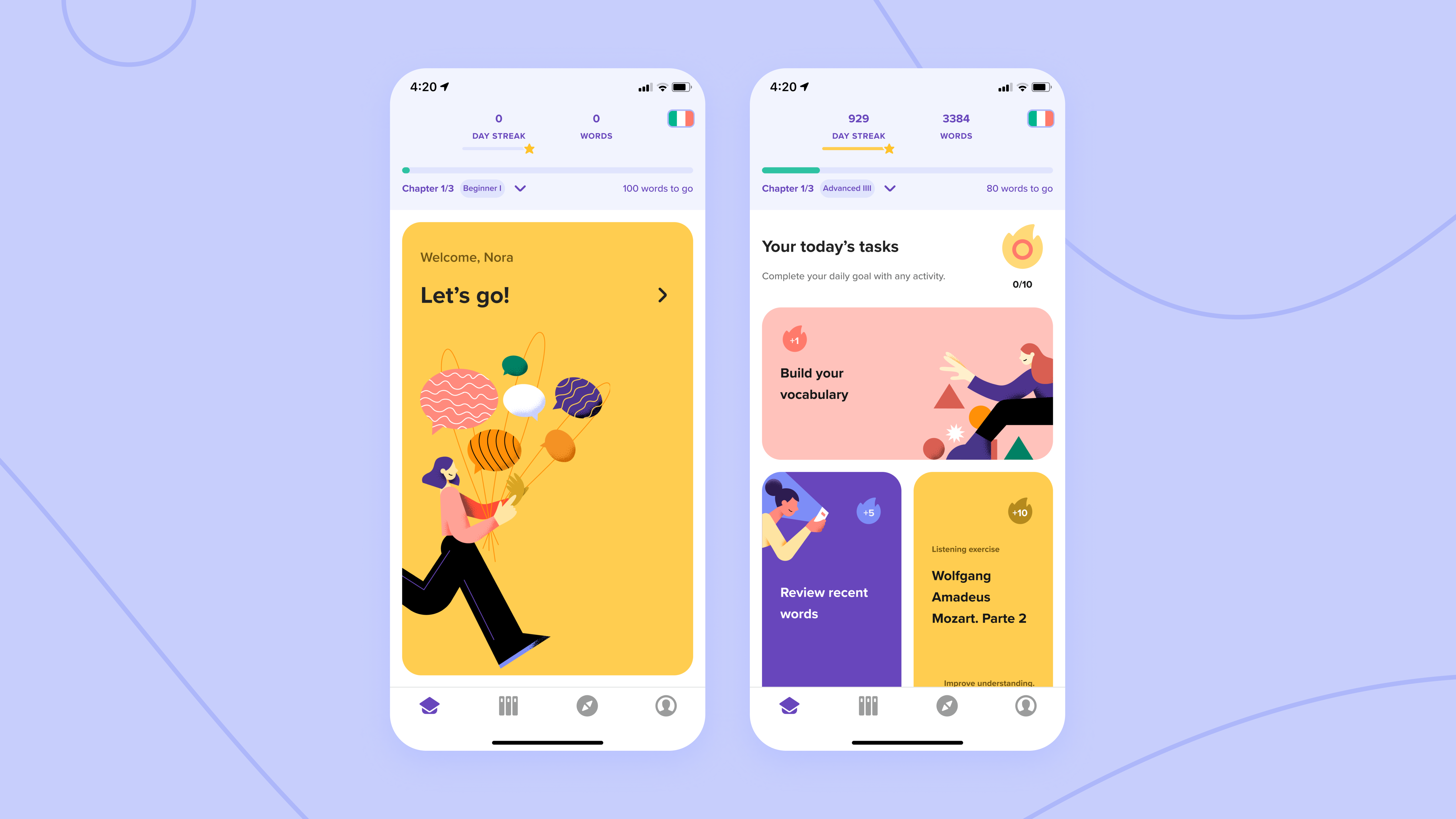
Then we updated Classroom using the new identity.
CHARACTERISTICS
Memorable and engaging start screen
New visual styles and illustrations create a better first impression and make the app experience memorable.
Bottom navigation to find content
The navigation system got an update: transitioning to the bottom navigation. This improves accessibility to study content.
Result
ENGAGEMENT
Medium % increase (NDA)
APP STORE RATING
4.7 → 4.8
LEARNINGS
The results of this version are good proof that visuals are a significant part of emotional design and engagement, especially for an app like this. We got some great feedback after this release.
Regarding UX, after observing numerous user recordings, it became clear that to push the needle in the next iterations, the keywords should be in-depth personalization and even more guided variety to the studies. There are exciting solutions how to accomplish this with the start screen, but at this point, I can only leave you with the idea!
Impact and summary
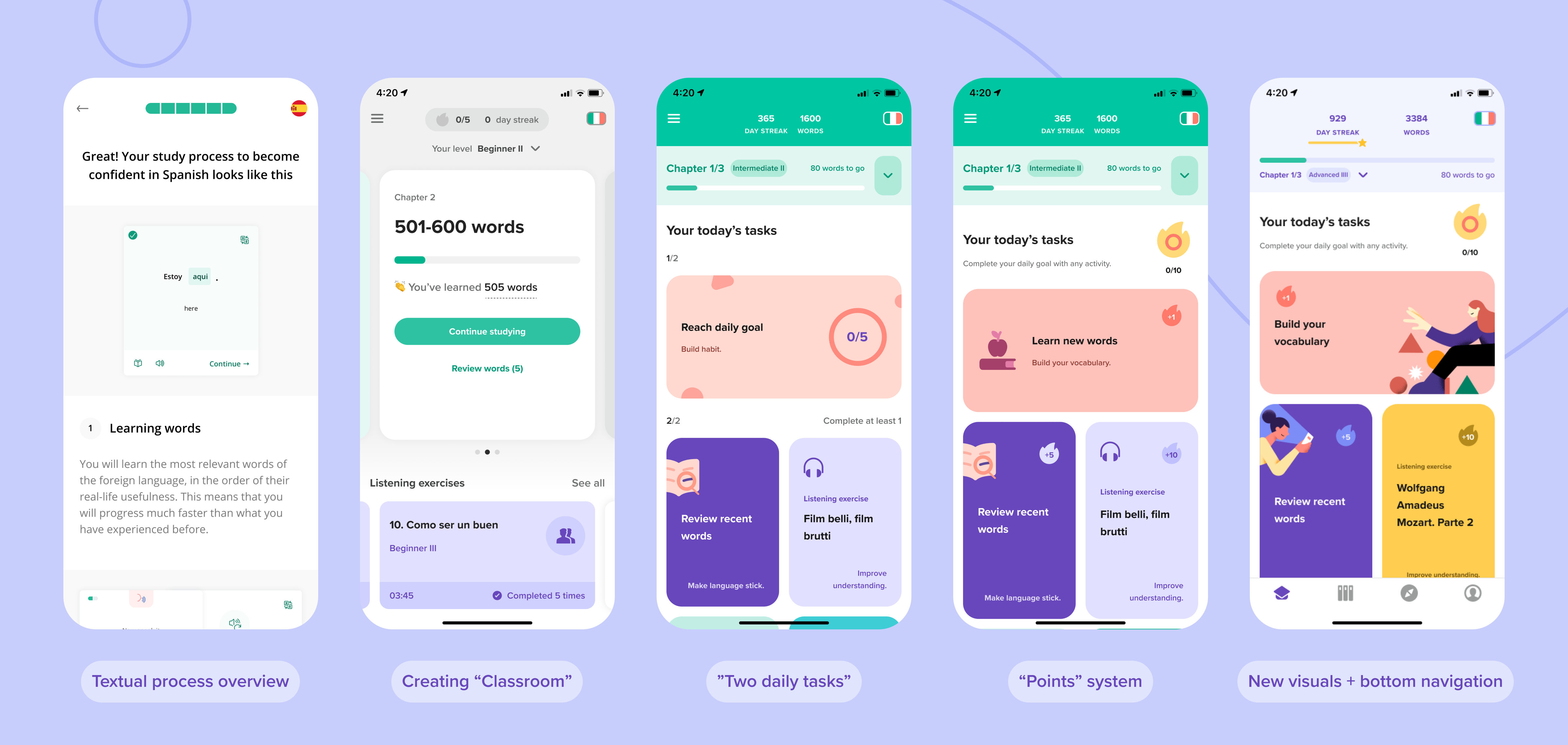
Timeline of all the solutions
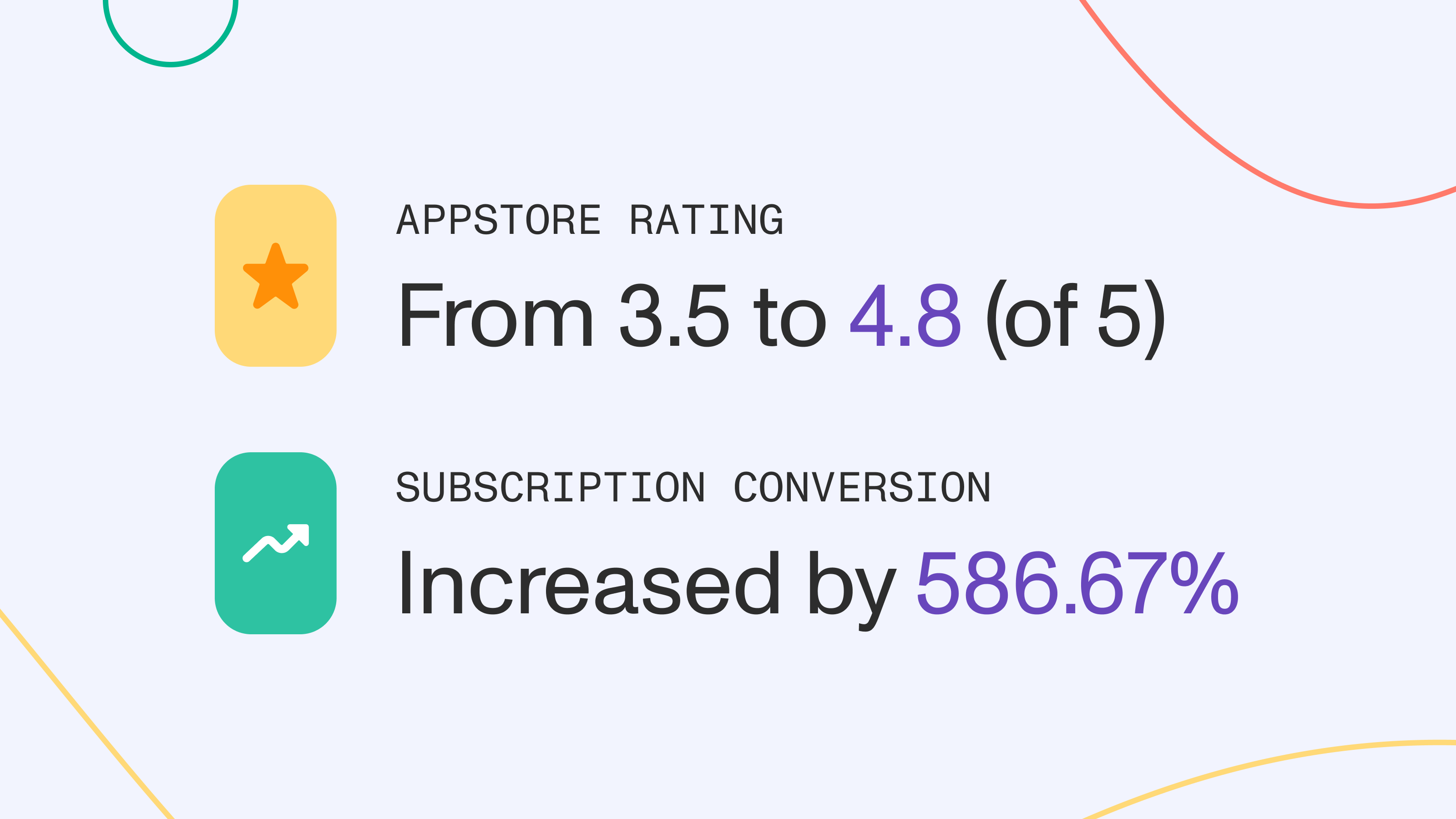
The results in numbers
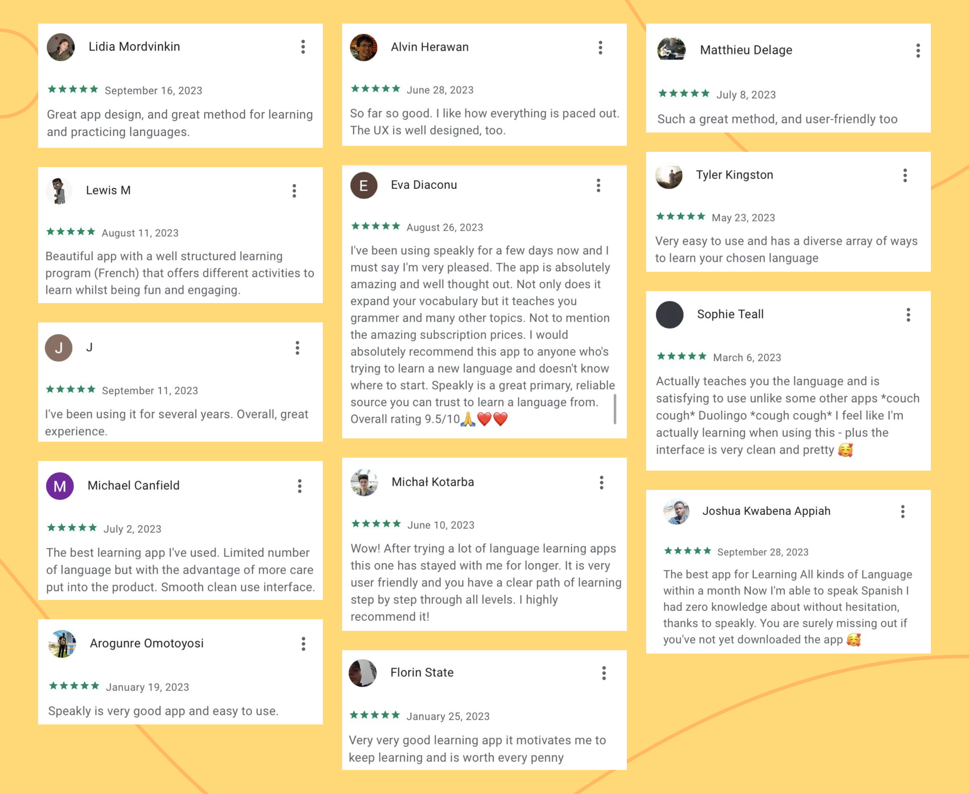
What users are saying...
Thank you for reading! 
Let's collaborate!
Write me at elinakapanen@gmail.com